How to create a Sticky Mobile Footer Menu in Flatsome Theme
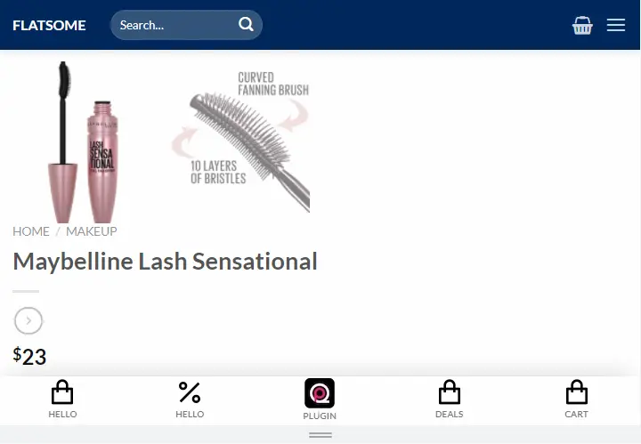
In this article, I’ll show you how to create a nice sticky footer mobile menu with your Flatsome theme. Get the pre-made Shortcode + CSS code below.
I’m using Flatsome Version: 3.14.3.
Before Starting Let’s See Demo of Sticky Menu
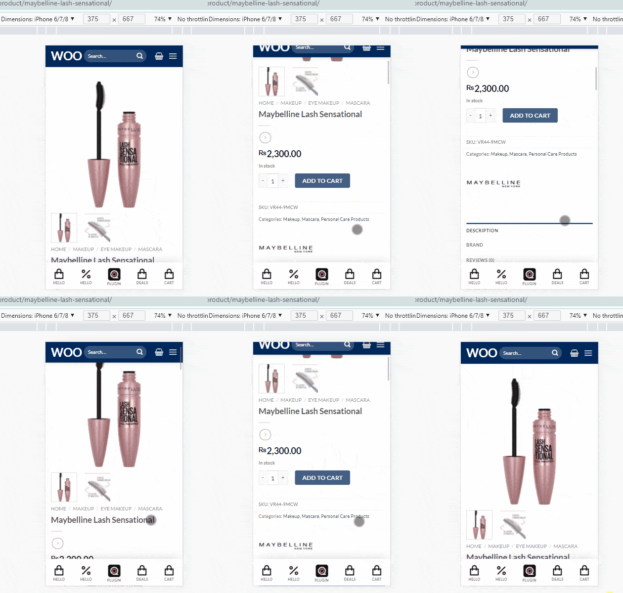
Let’s continue the post. Sticky Mobile Footer Menu for Flatsome Theme
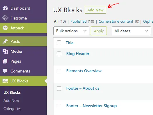
Create a new UX Block for Sticky Menu Flatsome
First, you need to create a new UX Block and choose the name Sticky Mobile Menu or any similar name you like.
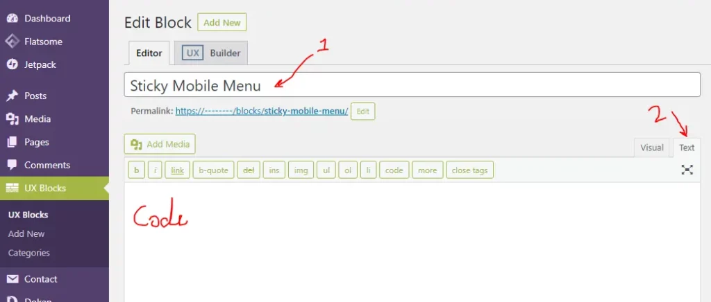
Set the name for the block or follow the no.2 highlighted arrow. choose Text and then place below code.
[row label="*Sticky Mobile Menu" style="collapse" width="full-width" class="sticky-mobile-menu" visibility="show-for-small"]

[col span__sm="12" padding="0px 0px 0px 0px" padding__sm="10px 0px 5px 0px" bg_color="rgb(255, 255, 255)" depth="5"]

[ux_stack distribute="around"]

[featured_box img="https://blog.hassam.dev/wp-content/uploads/2021/11/shopping-bag-line.png" img_width="32" pos="center" title_small="Shop" margin="0 0px 0px 0px" link="#"]

[gap height="0px"]


[/featured_box]
[featured_box img="https://blog.hassam.dev/wp-content/uploads/2021/11/shopping-bag-line.png" img_width="32" pos="center" title_small="Deals" margin="0 0px 0px 0px" link="#"]

[gap height="0px"]


[/featured_box]
[featured_box img="https://blog.hassam.dev/wp-content/uploads/2021/11/shopping-bag-line.png" img_width="32" pos="center" title_small="Account" margin="0 0px 0px 0px" link="#"]

[gap height="0px"]


[/featured_box]
[featured_box img="https://blog.hassam.dev/wp-content/uploads/2021/11/shopping-bag-line.png" img_width="32" pos="center" title_small="Cart" margin="0 0px 0px 0px" link="#"]

[gap height="0px"]


[/featured_box]

[/ux_stack]

[/col]

[/row]
After placing the code current block will look like the below image.
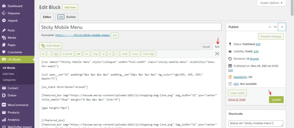
After placing the code click the publish/Update button.
Preview the Sticky Footer UX Block
Click view post after publishing the block.
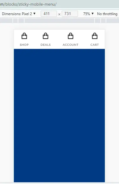
Now Customize UX Block using UX Builder
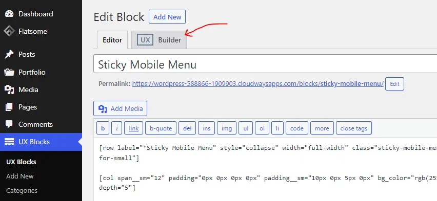
Now, click the UX Builder for customizing the menu.
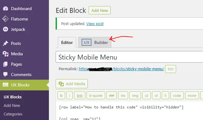
After choosing UX Builder you will see the below view.
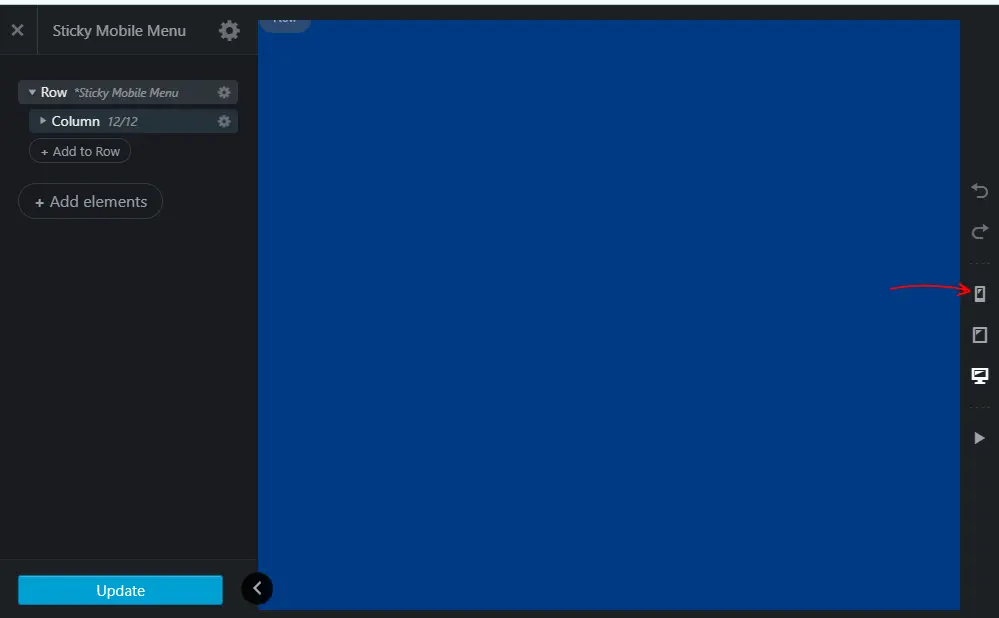
first, you’ll see nothing because I design this menu for mobile. So, click the Mobile icon from the right mini panel.
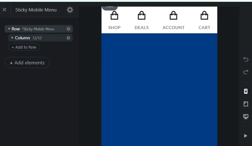
Let’s Customize the Sticky Footer Menu (icons, text and links etc)
Now, am going to show you how to customize the icons, text, link, and more. goto the dashboard, navigate UX Block, and click edit. (edit Sticky Footer Menu Block)
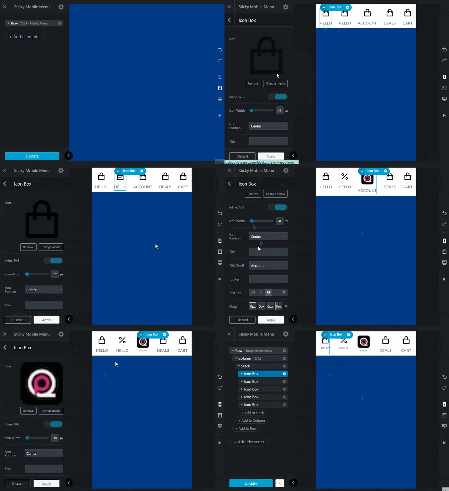
Footer Menu Customization Video
Now, we need to add custom CSS, before doing this close the UX Builder by clicking the cross button on the top-left corner.
Now add CSS to make Menu Sticky
We’ll customize the menu after adding CSS code. For adding CSS code you need a plugin namely Simple CSS Plugin, I strongly recommend this plugin. its lightweight and Tom Usborne is the creator of this plugin. Tom Usborne developed GeneratePress theme so, you can trust this plugin.
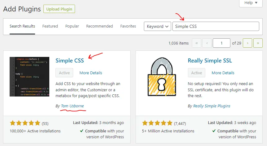
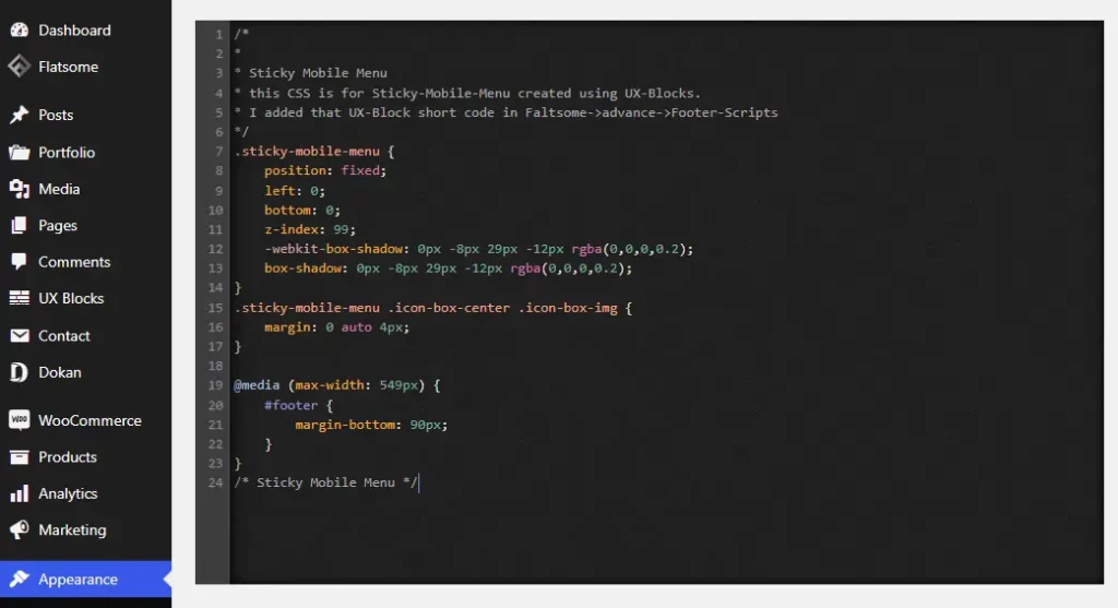
then go to Appearance -> Simple CSS and paste the below code there and save.
/*
*
* Sticky Mobile Menu
* this CSS is for Sticky-Mobile-Menu for a ux-block.
* added that UX-Block short code in Faltsome->advance->General Settings->Footer Scripts
*/
.sticky-mobile-menu {
    position: fixed;
    left: 0;
    bottom: 0;
    z-index: 99;
    -webkit-box-shadow: 0px -8px 29px -12px rgba(0,0,0,0.2);
    box-shadow: 0px -8px 29px -12px rgba(0,0,0,0.2);
}
.sticky-mobile-menu .icon-box-center .icon-box-img {
    margin: 0 auto 4px;
}

@media (max-width: 549px) {
	#footer {
    	margin-bottom: 90px;
	}
}
.sticky-mobile-menu .stack.stack-row a.plain {
    cursor: pointer;
    transition: 0.8s;
    padding-left: 6px;
    padding-right: 6px;
}
.sticky-mobile-menu .stack.stack-row:hover {
    background: rgb(238,174,202);
    background: radial-gradient(circle, rgba(238,174,202,1) 0%, rgba(148,187,233,1) 100%);
}
.sticky-mobile-menu .stack.stack-row:hover a.plain:hover {
  background-color: rgb(26 77 145 / 50%)
}
/* /_Sticky Mobile Menu */
after placing the code, that window will look like the below screenshot
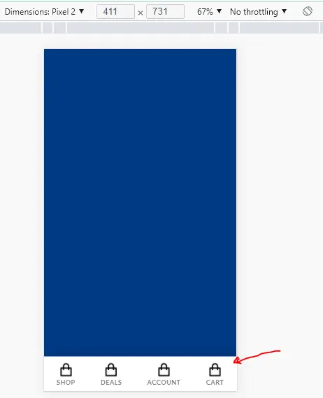
Then, goto again UX Block and view the recently create Sticky Menu Block on a mobile device. It will look like the below screenshot.
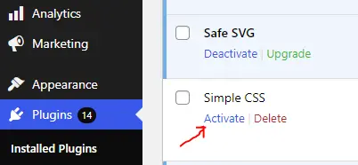
Deactivate the Simpel CSS plugin for a short while, if you face any screen shuffling while customizing the Menu using UX Builder. As we added custom CSS code which makes the menu sticky at the bottom, we achieve this functionality using custom code not with UX Builder. so, deactivate that SImpel CSS plugin and then customize Menu. and in last activate Simple CSS Plugin again :))
Activate Simple CSS Plugin again after Customization Menu
After, the customization menu, if you previously deactivated the Simple CSS Plugin, then activate the plugin.
Set Sticky Menu Globally accessible on all Pages
Now the sticky menu is designed, it’s time to make this menu globally visible. Here, am going to add this sticky menu block in Footer Scripts, Footer Scripts is feature that comes with flatsome theme. In WordPress dashboard, Flatsome -> Advanced -> Global_Settings and you’ll find FOOTER SCRIPTS there. But first copy the short-code of that block.
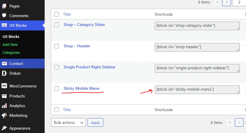
[block id="sticky-mobile-menu"]Copy short-code and goto WordPress dashboard, Flatsome -> Advanced -> Global_Settings and you’ll find FOOTER SCRIPTS.
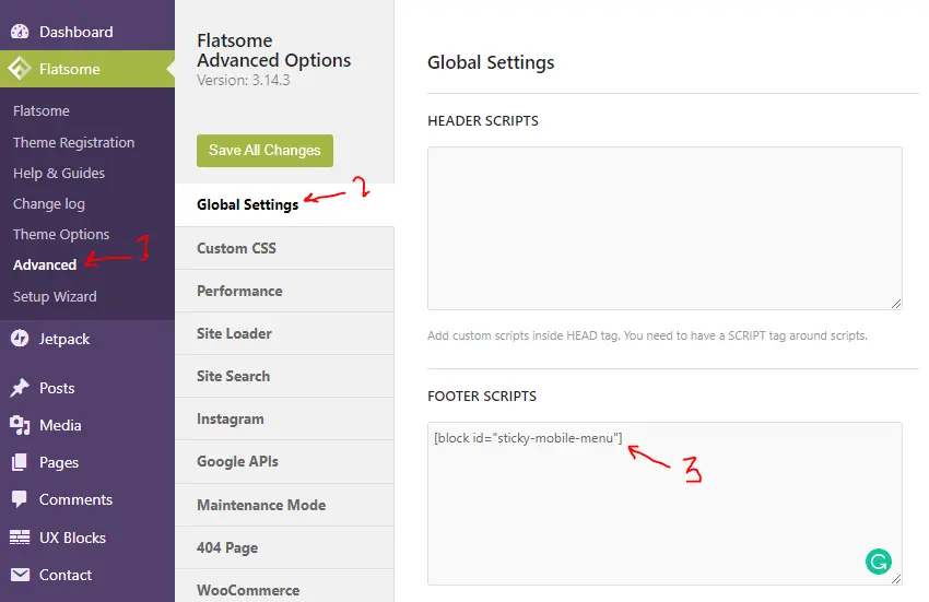
Follow the above image and paste the code there and save settings.
Finally, Sticky Footer Menu is designed and globally accessible on all pages.
After placing the shortcode, our menu will be accessible on all pages. let’s take a look below Gif.

Conflict you may face while customizing the menu later [fixed]
First, deactivate the Simple CSS Plugin, or comment CSS code.
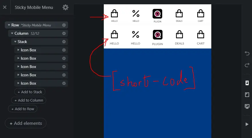
Don’t worry, 2nd Menu comes from [short-code] as we make this UX-Block global. Customize the 1st top menu and save the changes. and at the end activate or uncomment CSS code.
Hope you like this post. Comment below if you have any queries related Sticky Mobile Footer Menu for Flatsome Theme.


If you want to add hover effect on buttons then copy-paste the below code in the Simple CSS plugin.
This CSS adds a cool hover effect.
Hi,
Is it possible to make one of the links a Menu
I really like your blog.. very nice colors & theme. Did you create this website yourself or did you hire someone to do it for
you? Plz reply as I’m looking to create my own blog
and would like to know where u got this
from. appreciate it
Hi Asshuu, I created this blog myself.
great thx